EPA
EPA
Info
Elevating the foundations for an architecture and design practice.
Edward Parsley Associates had a long-standing reputation for craft and rigour, yet the brand no longer reflected the practice it had become. The identity felt static in a discipline defined by evolution, space and precision.
The opportunity was to reintroduce EPA with clarity and confidence, a contemporary expression aligned with its architectural ethos.
Our guiding belief was that architecture is the art of making space feel inevitable. The brand needed to carry that same sense of minimalistic assurance: confident, understated, and grounded in proportion.
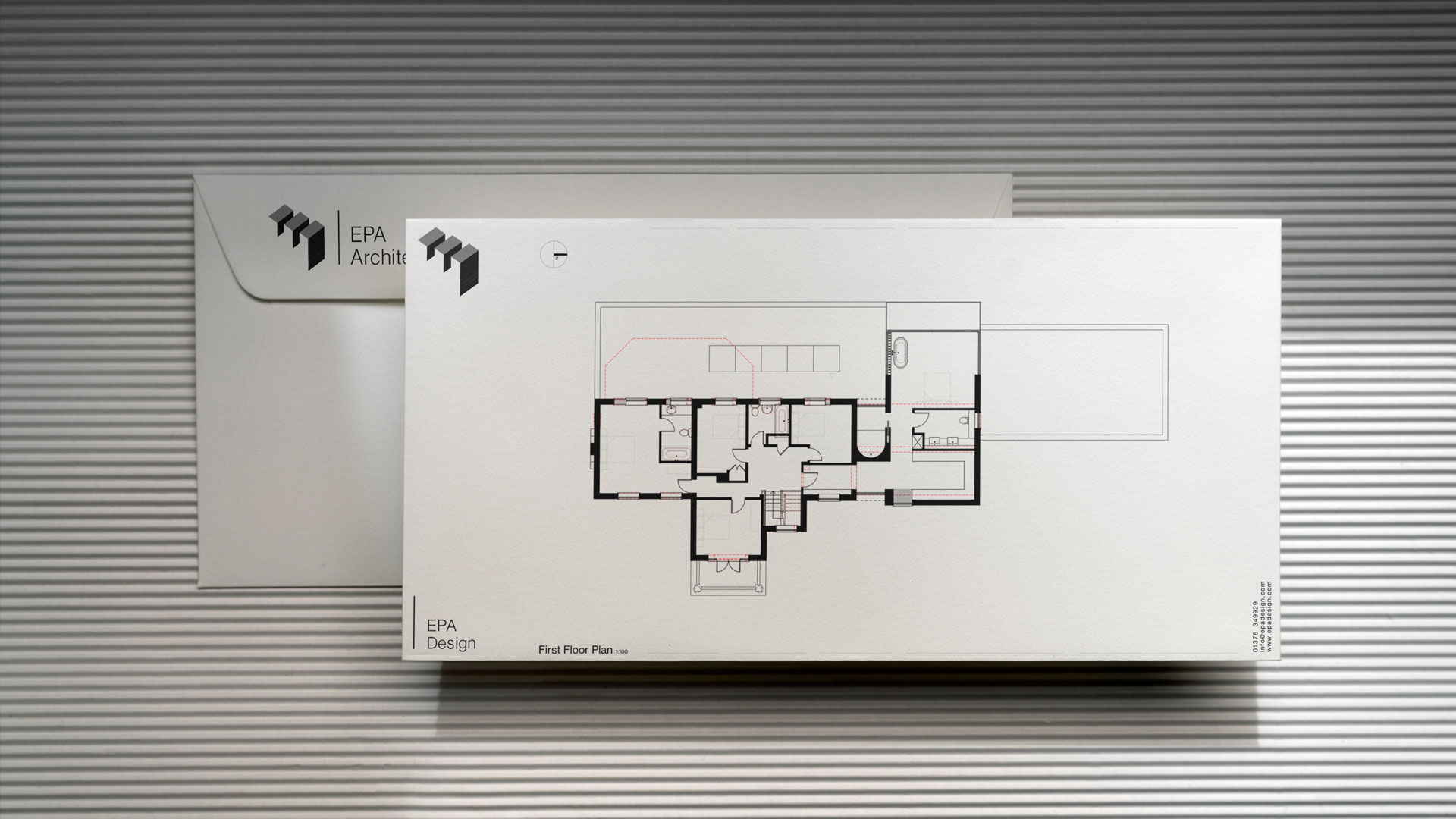
We set out to build an identity that translated the geometry of architectural plans into a living, breathing design language.
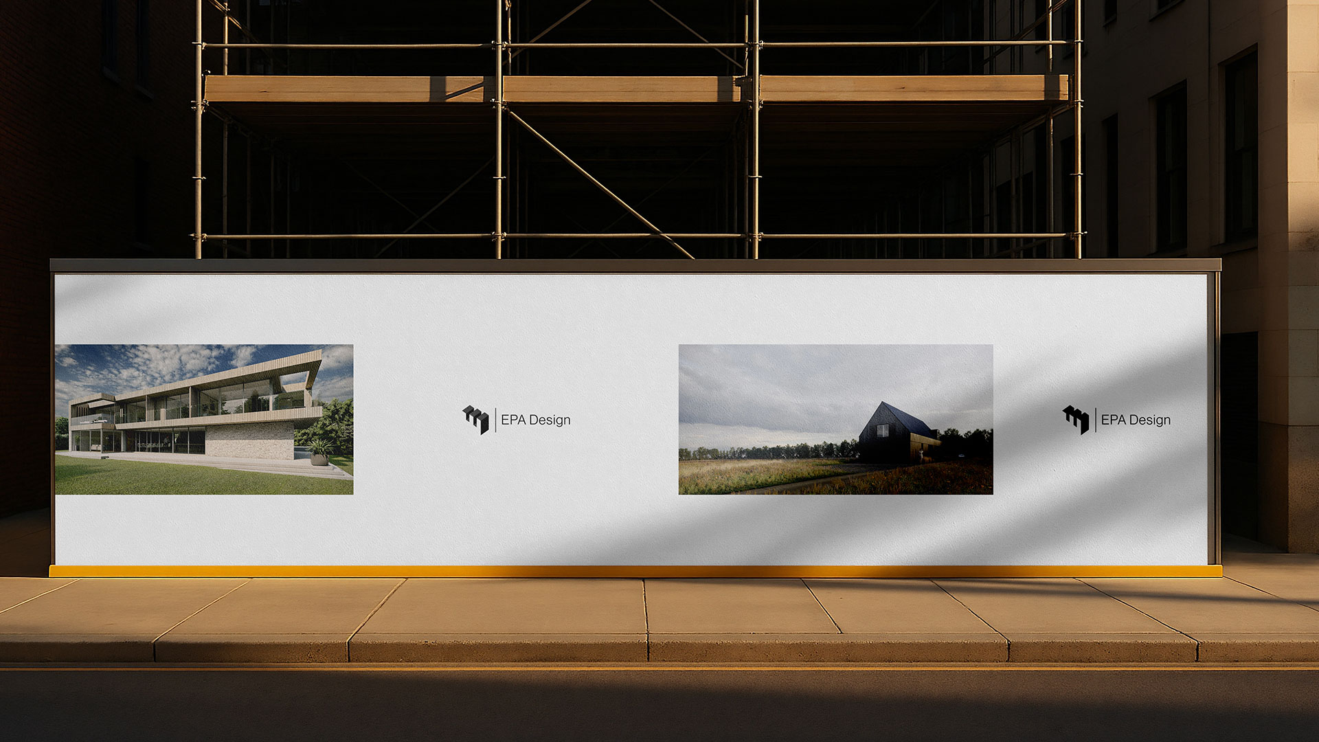
EPA’s new identity is defined by reduction and rhythm, a system rooted in grids, line work, and considered spacing.
The logomark takes cues from the structural harmony of architectural drawings, while the wider brand world uses scale, white space and typographic precision to create a sense of calm authority.
What begins as 2D planning becomes a spatial experience across digital, print, and physical touchpoints — a brand that behaves like the environments EPA creates.
Edward Parsley Associates re-emerges as EPA Design — a practice with a modern identity that mirrors its true purpose: elevating design in the spaces we live.
The brand now carries the same clarity and confidence found in their work, offering a cohesive foundation for growth, visibility, and future-facing architectural thinking.
Elevating the foundations for an architecture and design practice.
Edward Parsley Associates had a long-standing reputation for craft and rigour, yet the brand no longer reflected the practice it had become. The identity felt static in a discipline defined by evolution, space and precision.
The opportunity was to reintroduce EPA with clarity and confidence, a contemporary expression aligned with its architectural ethos.
Our guiding belief was that architecture is the art of making space feel inevitable. The brand needed to carry that same sense of minimalistic assurance: confident, understated, and grounded in proportion.
We set out to build an identity that translated the geometry of architectural plans into a living, breathing design language.
EPA’s new identity is defined by reduction and rhythm, a system rooted in grids, line work, and considered spacing.
The logomark takes cues from the structural harmony of architectural drawings, while the wider brand world uses scale, white space and typographic precision to create a sense of calm authority.
What begins as 2D planning becomes a spatial experience across digital, print, and physical touchpoints — a brand that behaves like the environments EPA creates.
Edward Parsley Associates re-emerges as EPA Design — a practice with a modern identity that mirrors its true purpose: elevating design in the spaces we live.
The brand now carries the same clarity and confidence found in their work, offering a cohesive foundation for growth, visibility, and future-facing architectural thinking.
Services
Services
Brand Strategy
Brand Strategy
Brand Identity
Brand Identity
Client
Client
EPA
EPA
Year
Year
2025
2025


More
projects

Naming
/
Brand Identity
Greenpoint Gin
Brand Strategy
/
Brand Identity
Petfolk
Brand Strategy
/
Brand Identity
Wise Track Collective

Brand Identity
/
Web Design
Cutting Horse

Brand Identity
/
Web
Health Club

Brand Identity
/
Packaging
Stauning Gin
Brand Design
/
Packaging
Better Wild

Brand Strategy
/
Brand Identity
Philips Beauty
Web Design
/
Web Development
Edward Hugo
Brand Strategy
/
Brand Identity
Petfolk

Art Direction
/
Web Development
Art & Objects